


Blog
About MONJI+
The philosophy, vision, and future MONJI+ aims for
Features
Power your results with AI, data, and teamwork. All you need for web operations in one platform
Find features by goal
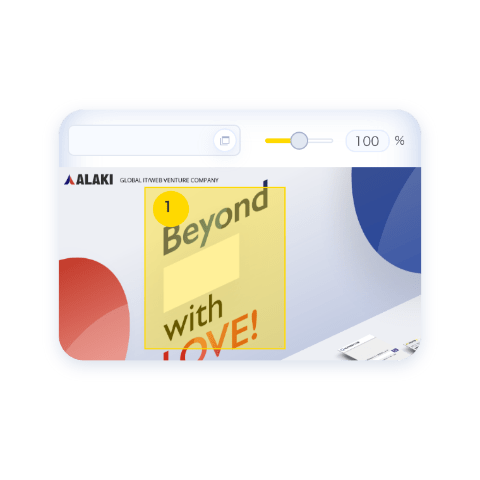
Feedback features

Don't let feedback end at comments

Site Management & Improvement
Find issues, fix them, and drive improvement

AI features
AI and teams working together

Knowledge Sharing & Team Development
Build a strong team that doesn’t depend on individuals

Security features
Security that protects your team's important data

Core features
Core features that power your WebOps
Use Cases
Maximize the results of your WebOps with MONJI+
Basic Usage
| The foundation that supports your resultsAbout Teams/Projects
Key Topics
- What Teams and Projects are
- What Teams and Projects manage
- How to get started
About Members/Guests
Key Topics
- What are Members and Guests?
- How Members and Guests differ (scope & abilities)
- Invite by who's involved
What is MONJI Flow Fabric?
Key Topics
- Why WebOps becomes a cycle of continuous improvement
- How MONJI+ differs from traditional WebOps
- Practical examples of MONJI Flow Fabric
Use Cases by Industry
| Practical use cases tailored to your challengesMONJI+ for Web Agencies
Key Topics
- 5 everyday scenes where agency work gets stuck
- Workflows powered by MONJI+
- Common questions before getting started
MONJI+ for In-house Web Teams
Key Topics
- 5 everyday scenes where WebOps gets stuck
- Workflows powered by MONJI+
- Common questions before getting started
MONJI+ for Ad Agencies
Key Topics
- 5 everyday scenes where improvement proposals get stuck
- Workflows powered by MONJI+
- Common questions before getting started
Pricing Plans
Choose the best plan for your team size and goals
User Support
Your go-to support page for troubleshooting and getting the most out of MONJI+
Usage Guide (Support Site)
Easy-to-follow guidance from basic operations to advanced features of MONJI+.
Popular Guides
FAQ (Support Site)
Find answers to frequently asked questions and solutions to common issues.
Top Questions
Re:MONJI
A co-creation development program that evolves MONJI+ together with our users.
Contact Us
If you have any questions or concerns, please feel free to contact us.

Jul 1, 2026
WebOps
“AI can make beautiful designs instantly. So why doesn’t our website feel like us?”
“AI can help us create clean, polished designs quickly. But somehow, it still doesn’t feel like our company.”
Recently, we have been hearing this kind of comment more often in website production and operation.
With the spread of generative AI, the barrier to creating visually polished designs has dropped significantly. In just a few minutes, it is now possible to generate design ideas that look well-balanced and presentable.
That is useful. Very useful.
But because it has become easier to create something polished, a different kind of problem has started to appear.
“Every website looks somewhat similar.”
“It looks clean, but it does not stay in your memory.”
“It is hard to communicate the brand’s personality or warmth.”
We have felt the same thing in our own website operation work.
Against that background, hand-drawn and hand-crafted design elements are beginning to attract attention in 2026. These are designs that show traces of human touch: loose lines, handwritten elements, collage-like layouts, stickers, marker-style highlights, and illustrations that feel intentionally imperfect.
In this article, we will look at why hand-crafted aesthetics are being chosen in an age where AI can create clean visuals for almost anyone, and how teams can introduce them into real website projects.
Why this problem happens
Background 1: polished design no longer feels as special as it used to
Until recently, creating a polished website required a certain level of knowledge and experience.
Spacing, color, typography, photography, layout, visual hierarchy — a “clean website” was built by carefully layering many small decisions.
Now, with generative AI, almost anyone can create polished visual ideas in a short amount of time.
That is a major improvement. It makes early drafts faster, helps teams explore directions, and can speed up the production process.
But as polished designs become more common, “looking clean” becomes less of a differentiator.
When many sites share the same smooth, well-balanced look, they can start to feel similar. They may be easy to understand, but harder to remember.
This is where slightly imperfect, hand-crafted expressions become useful.
For example:
- doodle-like lines
- handwritten text
- sticker-like accents
- collage-style photo layouts
- marker-style highlights
- loose, friendly illustrations
These elements add a sense of human presence to screens that might otherwise feel too polished.
Background 2: users are not only looking for beauty — they are sensing personality
People do not look at websites only to collect information.
They also sense the personality of the company.
The atmosphere of the shop.
The people behind the product.
The warmth and care behind the service.
A polished AI-like visual can be useful for organizing information. But depending on the brand, it may not be enough to communicate personality, warmth, or human character.
What we have felt in the field is that slightly uneven, human-made elements can sometimes remain in the viewer’s memory more strongly than something perfectly polished.
The better AI becomes at creating clean designs, the more valuable human “character” may become.
That may be one reason hand-drawn and hand-crafted design is gaining attention.
Steps to introduce hand-crafted design elements
Hand-crafted design is not something you should add everywhere just because it is trending.
If you overdo it, the site can become hard to read or look messy. The important point is not to break the whole design, but to add a small amount of texture on top of a solid foundation.
Here is a practical three-step approach.
STEP 1: Visualize the current state of the website
Start by looking at how the current website feels.
The points to check are:
- Is the site clean, but lacking memorable elements?
- Does it communicate the brand’s personality and warmth?
- Do the photos, headings, icons, and spacing feel distinctive?
- Are there any expressions that make users feel, “This feels like this company”?
Before adding hand-drawn elements, it is important to understand the current impression of the site.
At this stage, try not to judge only by personal design preference. It is better to review the screen with the website operation team and discuss questions such as:
“Where does the site feel too polished?”
“Where could we add a small human touch?”
“Which parts should stay clean and easy to read?”
When sharing observations and improvement points across a team, a WebOps platform such as MONJI+ can help keep comments attached to the actual screen, making it easier to review and improve the site later.
STEP 2: Choose only one or two places to add texture
Next, decide where to add hand-crafted elements.
The key is not to cover the whole site with them.
Hand-crafted expression is seasoning. It is not the foundation.
For example, you might:
- add a handwritten-style accent to part of a heading
- use loose line drawings for icons or dividers
- make photos look slightly tilted, as if they were placed by hand
- add one small interaction where an element bends or shifts with cursor movement
- use a marker-style highlight on an important phrase
The important thing is to protect readability.
If all body text is set in a handwritten-style font, long passages may become difficult to read. A handwritten word in a heading can work well as an accent, but using the same style across the entire page can create stress for readers.
The same is true for collage and sticker-like elements. If you add too many, users may not know where to look.
As a loose rule, we try to keep hand-crafted elements to one or two per screen.
Only part of the design should be loosened.
The foundation should remain stable.
That balance is the basic principle for using hand-crafted design well.
STEP 3: Check whether it fits the brand and industry
Finally, check whether the expression truly fits the brand.
Hand-drawn and hand-crafted design is not suitable for every website.
It often works well for sites such as the following.
Personal brands and small shop websites
When the person behind the business matters, handwritten notes or slightly rough photo layouts can create a sense of familiarity.
Instead of making everything too clean, showing a little human touch may help communicate the person’s character or the atmosphere of the shop.
E-commerce sites for craft, food, or lifestyle goods
When the product itself has a handmade or material quality, adding texture to the website can help connect the screen to the product world.
A perfectly polished design may not fully communicate the feel of the material or the care of the maker. Hand-crafted details can help fill that gap.
Recruitment and culture pages
Hand-crafted expressions can also work well when a company wants to show its people and culture.
A slightly loosened layout may sometimes communicate the atmosphere of the team better than overly polished photos and rigid sections.
On the other hand, there are sites where this approach can be harder to use.
For example, websites close to finance, healthcare, or public services often need to communicate accuracy, reliability, and reassurance first. If the entire site becomes too hand-drawn, it may feel unserious or unreliable.
The point is not to add the trend because it is popular.
The real question is:
“Does this expression fit the personality of this brand or business?”
What we are seeing in the field
What we have started to feel in actual production work is that the roles of AI and human judgment are becoming clearer.
AI is useful for organizing the foundation and creating early drafts quickly.
But the final decisions still depend on people:
Where should the design be loosened?
Which expression feels true to the brand?
How far can we go without damaging readability?
Which details will make the site feel more human?
Those decisions still require human judgment.
In other words, AI and human craft do not have to compete.
Let AI help with polish.
Let humans hold the personality.
Hand-crafted design is one way to do that.
In an age where many designs are becoming cleaner and more uniform, traces of human touch may stand out more than before. The growing attention around hand-drawn and hand-crafted aesthetics in 2026 may be one small sign of that shift.
Points to be careful about
Hand-crafted design can help communicate warmth and personality.
But if used incorrectly, it can have the opposite effect.
Here are three points to watch.
Do not sacrifice readability
Handwritten-style fonts can be effective as accents.
But when used for all body text, they can make longer passages difficult to read. Important explanations and longer content should usually remain in highly readable fonts.
It is better to separate the areas where you add texture from the areas where readability must be protected.
Do not make the screen too busy
Stickers, collages, line drawings, marker effects, and handwritten accents can all add personality.
But if you use too many at once, the screen can become noisy. Users may not know where to look, and the message may become harder to understand.
In many cases, one or two hand-crafted elements per screen is enough.
Check the fit with the brand and industry
A trend does not fit every site.
For industries where trust, precision, and reassurance matter most, using hand-drawn expression across the entire site may create discomfort.
Design trends are not goals in themselves.
The first question should always be:
Who are we speaking to?
What do we want them to feel?
What kind of impression should this website leave?
Hand-crafted design should be treated as one possible method, not as a rule.
MONJI+, a WebOps platform built from the field
When introducing hand-crafted design elements, the final quality depends on review and improvement in the field.
“Does this expression fit the brand?”
“Is readability still protected?”
“Does the intended impression come across to the viewer?”
These questions cannot always be answered by designers alone. Production teams, marketers, operators, clients, and internal members may all need to review the site from their own point of view.
MONJI+ was created to address the kinds of issues we have seen in real website operation work.
MONJI+ is a WebOps platform that brings the people involved in website operation together as one team, helping them solve issues across the entire website operation process.
We are not trying to build a product that is finished from the beginning.
The real problems are in the field. That is why we continue listening to the real voices of people involved in website operation.
By receiving each piece of feedback, resolving small points of friction, and continuing to improve, new features have been born from actual operational challenges.
For teams that want to make website improvement and operation easier across production companies, business teams, and internal stakeholders, please take a look at MONJI+.
▼ About MONJI+
https://monji.tech/plus/
▼ About co-creation
https://monji.tech/plus/co-creation/
▼ Start free
https://tool.monji.tech/signup
Summary
AI has made it easier for almost anyone to create polished web designs.
At the same time, a new challenge has appeared: websites may look clean, but feel similar. They may be well organized, but not strongly memorable. They may be beautiful, but not clearly “us.”
The growing interest in hand-drawn and hand-crafted design can be understood as a response to that sameness.
However, the answer is not to make the entire site hand-drawn.
The important thing is to keep the foundation clean, then add a small amount of texture. A heading accent, icon, divider, photo treatment, or marker-style highlight can add warmth without hurting readability.
The goal is not to follow a trend.
The goal is to check whether the expression fits the brand, supports the intended impression, and keeps information easy to understand.
When used carefully, hand-crafted design can become one useful way to add personality to websites in the AI era.